Site speed metrics can be obtained using the Lighthouse auditing tool, which can be run within Google Chrome. Metrics like this have started to become used in SEO ranking, so naturally if efforts are being made to improve site speed, it makes sense to measure and report on it. When tasked with creating a dashboard displaying Lighthouse metrics over time, what better way to display the current score for each metric than in the very same gauges Lighthouse itself uses in its reports?

It’s a fairly minimalist gauge which could easily be used in other reports, not just those on site speed performance metrics. This post explains the steps I took in recreating it within Google Data Studio.
Reverse Engineering
In almost all cases, if you want to see how a certain website element was created you can just right-click and Inspect Element or view the Page Source, easy enough. As the Lighthouse reports are integrated directly in the Chrome Browser, this option isn’t available. Fortunately however, the Lighthouse reports can be exported into HTML, so the Page Source option becomes available after all.

The gauges have been sensibly named “lh-gauge” in the source, so searching through the rest of the source to find how this element is actually created leads to some JavaScript which credits this codepen post by Greg Douglas. This is an excellent post which goes through step by step the CSS and JavaScript methods used to create this effect.
The only component missing was the metric value in the center of the gauge, which can be easily updated within the same Javascript functions used. The function converts a value from 0-100 to a 360° value for the gauge, so based on a given min/max value, the metric value in the middle can be any number. Now that I have enough code to create the gauge, the next task was actually using it in a visualisation tool.
Community Visualisations
Most visualisation tools allow for custom charts and graphs to be inserted in some way, but for this project I chose Google Data Studio and its Community Visualisations feature. The documentation could be better, which tends to happen for niche Beta features within Google products, but it’s enough to understand the basics.
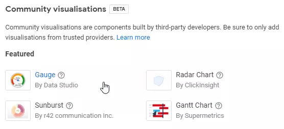
The example visualisation created is a bar chart, and there’s not much to go on when creating something besides a bar chart, such as a gauge. There are a few more visualisations found in the Experimental Visualisations Github, but still none which would help here, which is surprising given that there already is a Gauge available in Data Studio:

Another reverse engineering technique is to look at the Network Log and see what resources are being loaded onto the page, which is exactly what I did to see how the existing Data Studio gauge was built. When the above Gauge is added to a report, several resources from www.gstatic.com/analytics-lego/communityviz/devrel/googlecharts/gauge/... are loaded, which make up the required components of a Data Studio Community Visualisation.
From what was learned in the Data Studio documentation, I knew that all charts require a manifest.json which contains links to all of the resources used in the visualisation. This isn’t shown in the Network Log, but was found simply by manually searching for it in the same directory as the other gauge files: manifest.json.
So now with a complete working example of how to create a Gauge in Data Studio, and the raw CSS/HTML/JS for creating the Lighthouse Gauge, I was able to merge the two sources to create the desired result:

Free to Use
To use in your own Data Studio reports, open the Community Visualisation panel, then set the following as the manifest path:
gs://jjbuckley-datastudio/lighthouse-gauge/
Then set the following as the Component ID:
lhGauge
The three range values and colours can be configured to match whatever metric being visualised, as well as the font size and family. This can all be done in the Style tab of the visualisation, which I didn’t cover in this post, but might save for another post. If you’d like to see the complete source for this visualisation, then check out my GitHub.